

Company
NutriHealth Nation
project focus
Brand Identity Systems & Visual Language Design
Industry
Health
Design That Operates at Scale
NutriHealth Nation is a growing health and wellness company operating in a category crowded with visual noise and generic wellness cues.
As the business expanded, its brand expression became fragmented.
Different channels communicated different signals.
Consistency depended on individual teams rather than a shared system.
The business needed more than a new logo.
It needed a design foundation that could operate reliably as the organisation scaled.
The Challenge
The challenge was not aesthetic.
It was systemic.
NutriHealth Nation lacked a unified design language that could translate its values into consistent, usable expression across digital, physical, and organisational touchpoints.
From fragmented visual expression → to a defined design foundation.
The risk was clear:
Without a structured identity system, every new campaign, platform, or partnership would dilute the brand rather than strengthen it.
The Approach
We design systems that translate intent into capability.
Instead of starting with visuals, we started with meaning, usage, and scale.
We examined how NutriHealth Nation communicates, how teams create assets, and how design decisions are made across the organisation.
This shifted the question from:
“What should the brand look like?”
to:
“How should the brand work?”
Design became a system — not a surface.
What We Built
A structured brand identity system
We built a visual language designed for clarity, credibility, and long-term usability.
Typography, colour, and form were engineered to work together — not as decorative elements, but as functional components of a coherent system.
From isolated visuals → to connected design logic.
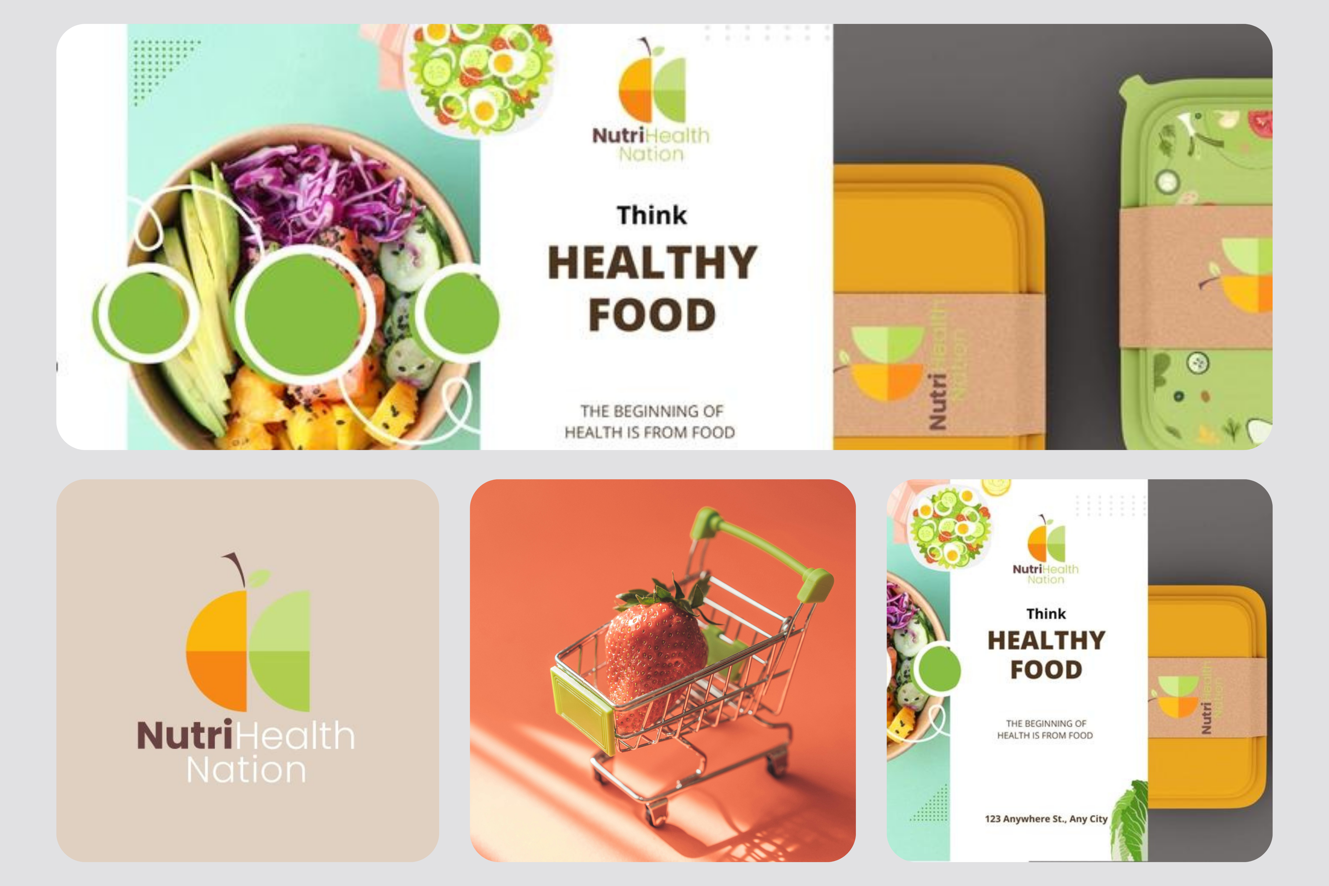
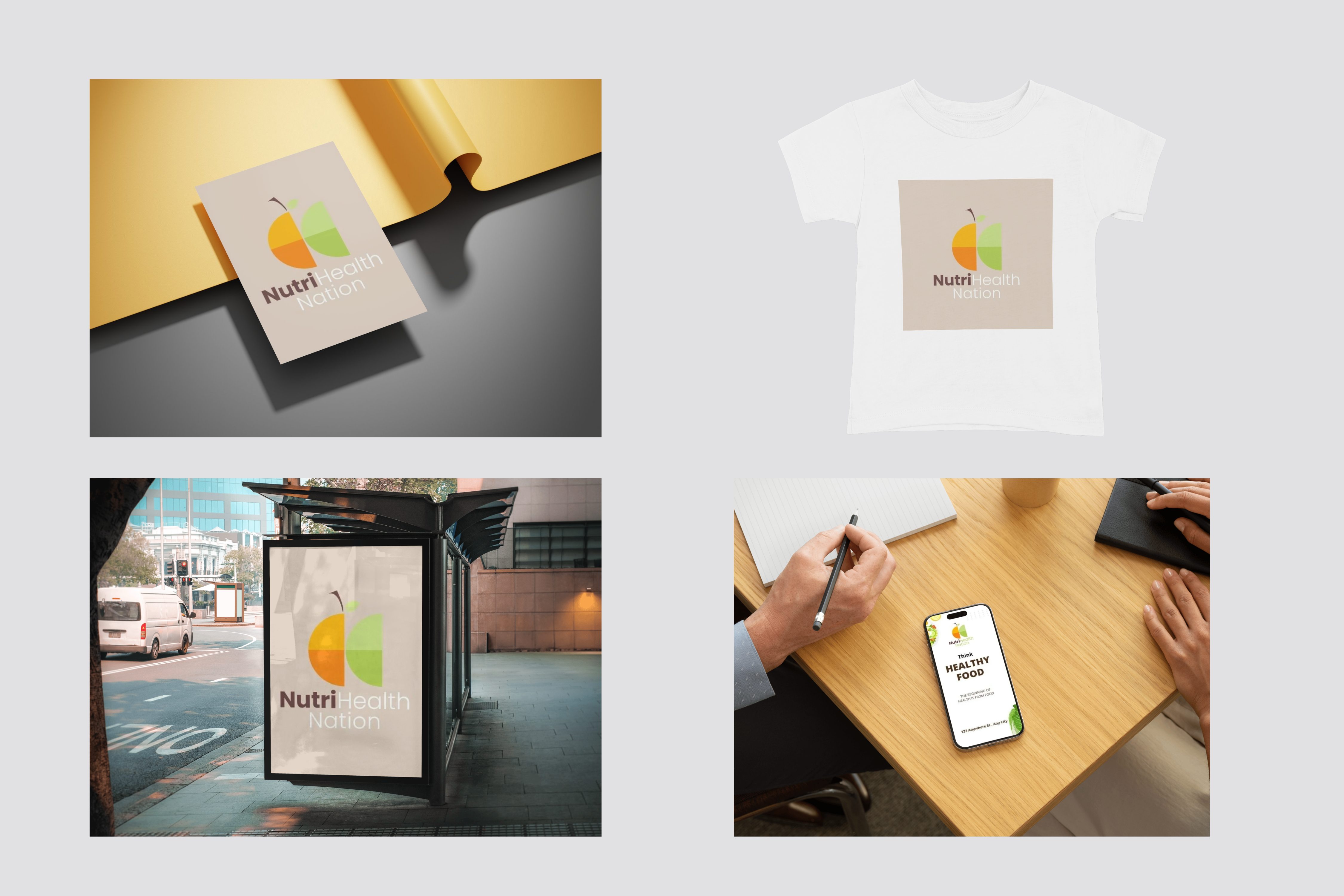
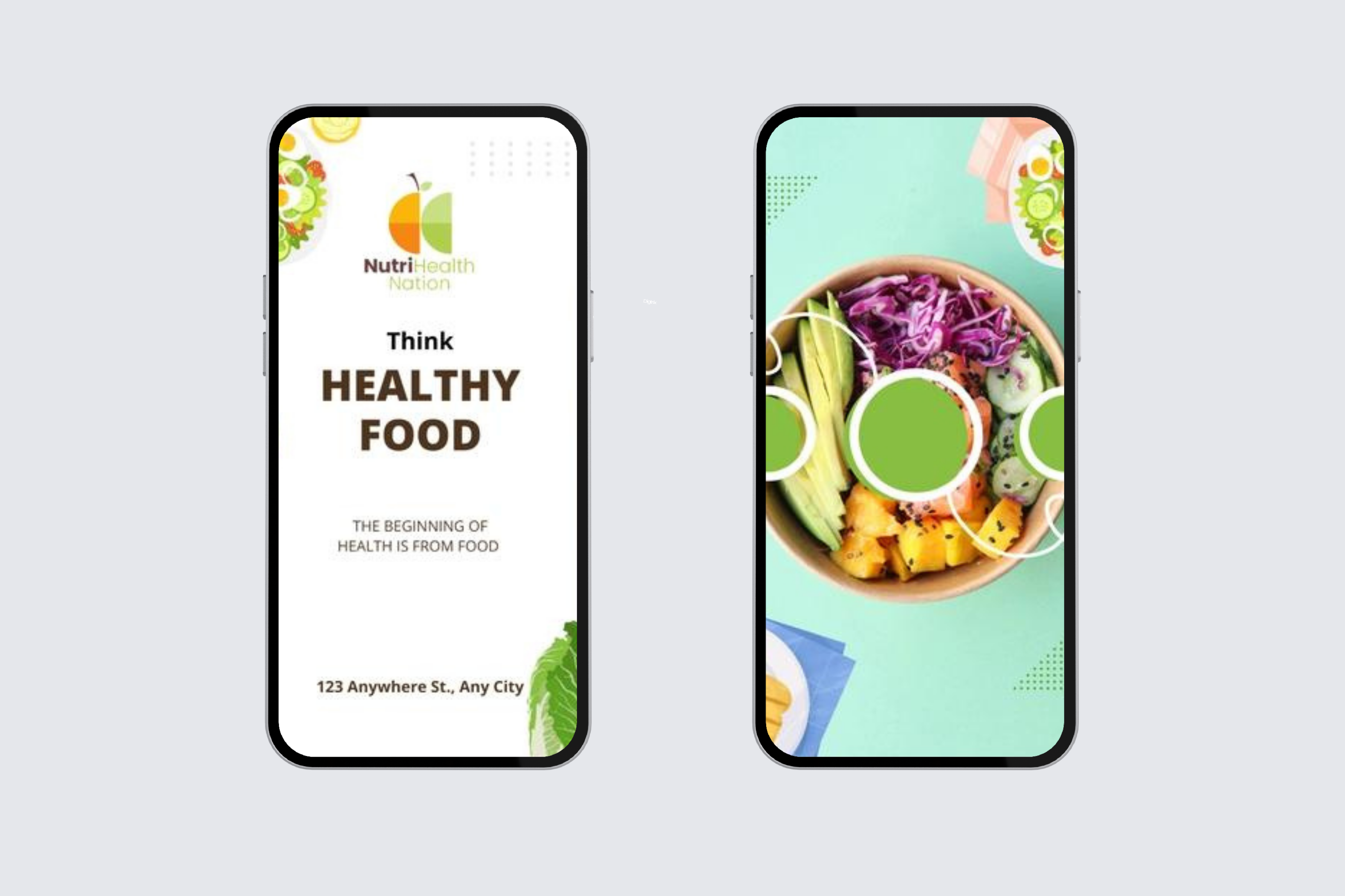
A scalable logo architecture
Multiple logo iterations were developed and tested for legibility, adaptability, and relevance across contexts.
The final mark was designed to function across digital interfaces, physical media, and future extensions without losing recognition.
From static symbol → to operational asset.
A cohesive visual framework
Supporting visual elements were designed as modular components rather than fixed templates.
This enabled teams to create new materials without breaking consistency.
From manual design decisions → to repeatable structure.
Practical brand governance
We engineered comprehensive brand guidelines that translated design principles into actionable rules.
These guidelines functioned as an operating manual — not a PDF artifact.
From design intent → to operational clarity.
Impact
The outcome was not a rebrand.
It was a design capability.
NutriHealth Nation gained:
- A recognisable brand system that remains consistent across channels
- A visual language aligned with business values and positioning
- A framework that enables teams to create without fragmentation
- Governance that reduces reliance on ad-hoc design decisions
From fragmented → to connected
From subjective → to structured
From manual → to scalable